Available Options
Colour & Finish
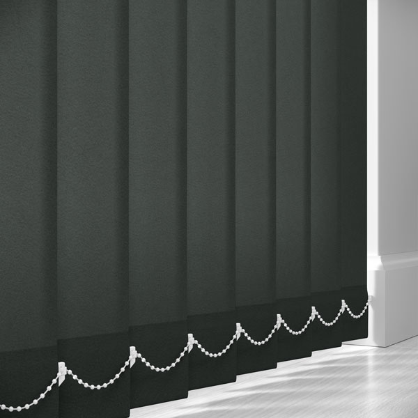
Colour: A deep graphite grey—darker than mid‑grey but softer than true black, with a neutral to slightly cool undertone.
Tone/Depth: Rich and grounded, offering strong presence without the starkness of black. It maintains depth while still allowing a gentle lift from light transmission.
Finish: Matte with a refined, lightly textured grain. The surface appears smooth at a distance, with subtle variation up close that adds depth and interest.
Visual impact: Creates a bold but balanced statement at the window. The dark grey softens contrast compared to black while still delivering a defined, contemporary line.
Material Look & Construction
Fabric feel (appearance): A tightly woven polyester with a fine, speckled texture that enhances its depth without introducing visible patterning. The vanes present a consistent, structured look with a slightly softened edge due to light diffusion.
Opacity: Light Filtering – reduces glare and maintains daytime privacy while allowing a muted, controlled flow of natural light.
Practical note: Graphite tones are highly practical—very effective at hiding dust, marks, and everyday wear. The durable polyester finish is easy to maintain, making it ideal for both busy homes and commercial spaces.
Room Styles That Match – "Somerton Graphite"
1) Modern Minimal / Contemporary
- Offers strong definition against white or pale interiors without harsh contrast.
- Keeps spaces sleek, balanced, and refined.
- Ideal for large glazing and patio doors.
2) Monochrome Layered Interiors
- Sits perfectly between black and grey tones for a softer contrast.
- Adds depth and layering within neutral schemes.
- Works well with matte finishes and subtle textures.
3) Industrial / Urban Living
- Complements concrete, steel, and exposed materials.
- The graphite tone echoes architectural elements without overpowering.
- Ideal for lofts and modern refurbishments.
4) Home Office / Workspaces
- Helps control glare without overly darkening the room.
- Creates a focused, professional environment.
- Pairs well with black accents and neutral desks.
5) Living Rooms / Everyday Spaces
- Balances natural light with privacy and mood.
- Provides a richer alternative to mid‑grey fabrics.
- Works across modern and transitional interiors.
6) Scandinavian with Depth
- Grounds light, airy palettes with a deeper anchor tone.
- Pairs well with pale woods, soft textiles, and warm accents.
- Prevents spaces from feeling overly light or flat.
7) Media Rooms / Flexible Light Control
- Reduces ambient light while maintaining usability during the day.
- A practical middle ground between light‑filtering and blackout.
- Works well with layered lighting schemes.