Available Options
PLEASE NOTE: The term 'blockout' refers to the fact that the fabric is designed not to allow light to pass through it. Light ingress and bleed will occur through the gap between each slat and the perimeter of the vertical blind unit.
Colour & Finish
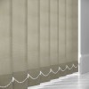
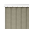
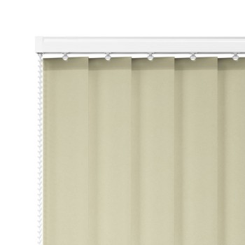
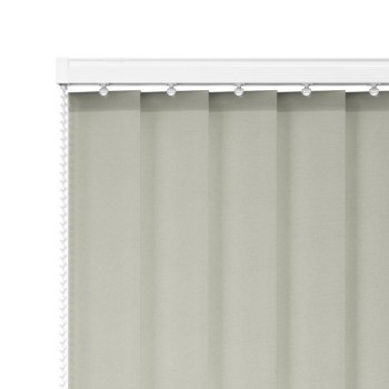
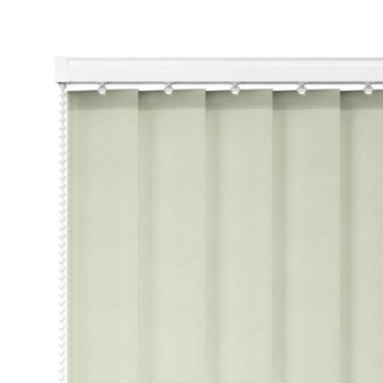
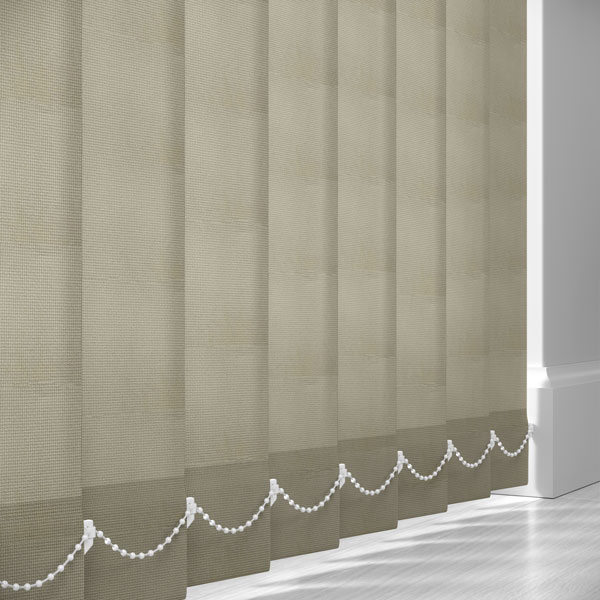
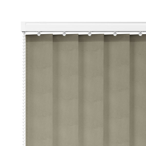
Colour: A warm taupe—blending soft brown and grey tones into a balanced, earthy neutral that sits between beige and stone.
Tone/Depth: Mid‑tone with a slightly grounded, natural feel; the blackout PVC construction gives the colour a solid, even depth without translucency.
Finish: Matte with a fine micro‑embossed texture. The subtle linear grain introduces a gentle surface detail that enhances depth while avoiding any gloss.
Visual impact: Creates a calm, sophisticated window treatment. The taupe tone adds warmth and depth to neutral schemes, making it more characterful than plain grey while remaining highly versatile.
Material Look & Construction
Fabric feel (appearance): A structured PVC slat with a lightly textured, wipe‑clean surface. The finish appears consistent, durable, and slightly more substantial than woven fabric alternatives.
Opacity: Blackout – fully blocks incoming light, ensuring maximum privacy and strong room‑darkening performance.
Performance features:
- Waterproof: Suitable for kitchens, bathrooms, and high‑moisture environments
- Mould resistant: Ideal for condensation‑prone or humid spaces
- Flame retardant: Meets safety requirements for residential and commercial use
- Wipe‑clean: Hygienic and easy‑maintenance surface
Practical note: Taupe is highly forgiving—excellent at disguising dust, marks, and wear while maintaining a refined appearance. The PVC construction ensures durability for long‑term use in demanding environments.
Room Styles That Match – "All‑Proof Taupe"
1) Warm Contemporary / Neutral Interiors
- Works beautifully with beige, cream, and soft grey palettes.
- Adds depth without introducing strong colour.
- Ideal for calm, modern living spaces.
2) Scandinavian Warm Minimal
- Pairs well with pale woods and natural textures.
- Softens otherwise cool interiors with subtle warmth.
- Keeps spaces balanced and inviting.
3) Traditional / Classic Interiors
- Complements wood furniture and neutral décor.
- Blends seamlessly into heritage-style homes.
- Suitable for lounges and dining areas.
4) Kitchens / Utility Rooms
- Waterproof and easy to wipe clean.
- Neutral tone suits cabinetry, tiles, and worktops.
- Practical for daily use.
5) Bathrooms / Wet Rooms
- Resistant to moisture, steam, and mould.
- Maintains consistent appearance over time.
- Warmer alternative to grey or white PVC.
6) Open‑Plan Living Spaces
- Blends across multiple zones effortlessly.
- Maintains cohesion without visual clutter.
- Works well on large windows and doors.
7) Offices / Professional Spaces
- Neutral, grounded tone supports a calm working environment.
- Provides glare control and privacy.
- Easy to maintain in busy settings.